Tuesday, July 29, 2008

ADVENTURES IN THE DESIGN WORLD™: U.S. Cellular Needs To Believe In Something Better Than This Shitty Billboard Design


The first time I saw this billboard, I was walking by myself down what I thought was a deserted street. Overwhelmed by the sheer ineptitude of the design, I actually blurted out "What the FUCK is that?" without even thinking I might be overheard. Of course, I was overheard by a young woman sitting on a porch, who proceeded to shoot me a nervous look which unambiguously said "Please don't hurt me".

Without further ado, let's jump right into an analysis of just what makes this billboard design look like it was thrown together in about three minutes by a Graphic Design 1 student in their first week of class.

1. Let's Talk About Fonts!

Clarendon is a beautiful typeface, even in all caps. Matrix II Italic Bold is one of those Emigre fonts that looked effing AWESOME in 1993 but passed its sell-by date no more than a couple years later. At least they didn't go for the inline version. But here's the thing, that headline uses a serif font with a semi-serif font -- and I don't give a shit if it's a slab serif, serifs are serifs and if you try to contrast a semi-serif with a serif, YOU FAIL. Add in the butt-ugly U.S. Cellular logo (which somehow manages to make Bodoni look bad!) and it looks like somebody ate the serif pages out of an old presstype book and puked all over their design.

Oh, and while we're talking about type, let's talk about the treatment. Why is the word "something" emphasized? Read that headline out loud: "Believe in something better." It sounds like life is a shit sandwich, and maybe someday something might possibly be better but it probably never will be. Why on earth did they not emphasize the word "better"?

2. Those Wavy Lines In The Upper Left-Hand Corner: Stroke Of Genius Or Design Aneurysm?

Looks like somebody's been watching the Illustrator tutorials on Smashing Magazine again...sigh. I mean, WTF does this have to do with the rest of the ad? Are the lines supposed to be cell phone radiation or something? They certainly don't represent a phone network because the lines don't intersect -- they're parallel. Dumbass.

3. What Are Little Girls Peeking Up Out Of The Inside Of Cardboard Boxes Made Of?

That photo...it's an ethnically-ambiguous girl with messed-up hair sitting inside a cardboard box with a big blue orb behind her. Let me say that again: It's an ethnically-ambiguous girl with messed-up hair sitting inside a cardboard box. What is this image supposed to be saying? That cell phones offer a brighter future for "those" people who live out of cardboard boxes in shanty towns? Is the giant, out-of-focus blue ball rolling towards her going to finally put the little girl out of her sad-sack misery? Not only does this photo not make sense in the context of a cell phone ad, it just plain doesn't make any goddamn sense in and of itself! [NOTE: Upon further inspection I discovered that the big blue orb was actually a result of my shitty camera. But that doesn't make this photo any more appropriate for the ad. So there.]

Please, designery people: we know you all hate your jobs and would rather be painting or sculpting or building all the useless shit you just learned about in Make™ Magazine during your daily B.M., but try to do the world a favor and maybe F*CKING THINK the next time you sit down to design something. Just for a couple of minutes even. Don't just slap together a company logo, a stock photo you got for free on a CD-ROM inside that one issue of Communication Arts you bought twelve years ago, your two favorite fonts of the week and an .eps file of the latest semi-hip illustrative tick you spent seven minutes learning how to incorporate into your "vernacular" and call it a design.

Christ on a crutch.

[ permalink ]

Wednesday, September 20, 2006

ADVENTURES IN THE DESIGN WORLD™ (VEGA$ EDITION): A Brief Survey Of Casino Carpeting, Part 2

I warned you it wasn't over, so here it is: the second installment in our three=part series spotlighting the casino carpeting in Las Vegas. In today's edition we're taking a whirlwind trip around the world by visiting three lovely casinos that attempt to recreate the experience of visitng famous cities.

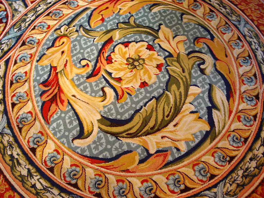
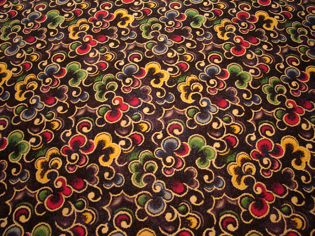
Let's begin our little trip in New York, New York. Three outstanding patterns to choose from here in the city that never sleeps; it's just like visiting the real thing except you don't have to ride the subway. Or experience any of the culture.


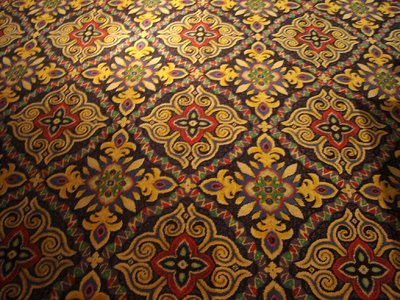
After soaking in the sites in the Big Apple, we make our way to The Venetian, where a little bit of Venice goes a long way. As with most of the newer casinos, the carpeting in The Venetian is thankfully more subdued than some of its elderly counterparts. We actually spent a little time inside admiring the cheesy replica streets and waterways -- and the gondolier who sang Volare in the style of an Elvis impersonator to the passengers on his boat was priceless.


And finally, we leave you with the faux impressionist carpeting that adorns the floors of Paris. It's just like those posters all your female friends in college had up on their dorm room walls, except it's socially acceptable to stomp all over it!


[ permalink ]

Tuesday, December 11, 2007

ADVENTURES IN THE DESIGN WORLD™: Indiana Jones and the Typography From Hell


So Gene K. points us to the new teaser poster for Indiana Jones and the Kingdom of the Crystal Skull, the movie that will almost surely prove to be the Phantom Menace of the last unsoiled LucasFilm franchise, and what do we get? Besides a slightly geriatric-looking, bland-as-oatmeal Indy pose and a big-ass un-be-nose-holed skull, we get what is quite possibly the worst typography in the series' history. Check out the differences in the "Indy font" used for the words "Indiana Jones" between the new poster and the original Temple of Doom poster:


The new typeface has less of an italic slant, the letterforms are clunky as hell (look especially at the "D", "A"s, and "S" in comparison to the Temple version -- it looks like a third grader who overdosed on Children's Nyquil drew them), and the kerning/overlapping choices are cartoony at best, atrocious at worst. I know tight kerning is all the rage ever since everybody got the whole "Illustrator lets me kern this shit out to over 500 now!" out of their system in the mid nineties, but come on, it's not like you've got a narrow column width to deal with -- it's a fricking logo!

Couldn't they just have scanned in the old photostat and traced it?!? Jesus H.

[ permalink ]

Tuesday, October 31, 2006

JOHN EATS CONTEST™: Win A T-Shirt You Probably Won't Feel Comfortable Wearing In Public!


We've hit a milestone here at JohnEats.com -- we've been blogging here now for over three months! That's the Internets equivalent of 28 in human years! And to celebrate, we're presenting the first-ever John Eats Contest™!

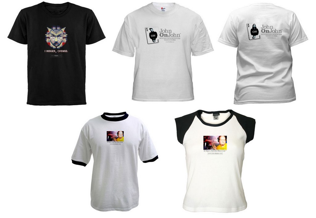
The winner of this contest will receive a fabulous prize: their choice of one of the t-shirts shown above, free of charge (but not of guilt)! These amazing t-shirts come in several styles: The "I Hunger, Coward" Black Tee, John On John™ (for men), John On John™ (for women), The DJ Dijon Men's Ringer Tee, and The DJ Dijon Women's Cap Sleeve Tee. In order to win one of these highly sought after personal apparel SKUs, here's all you have to do.

CONTEST RULES

Your task is to create your very own JohnEats.com blog post. Your post should fit easily into one of our previously-established Departments (the complete list can be found in the sidebar at the right) like "Adventures In The Design World™," "ArtFarts™," "Why God Created YouTube™," etc.

Your post should come fully illustrated with either a YouTube video or jpeg image. If you have a great idea that you just can't illustrate, let us know in your submission and if we like your idea enough, we might just be nice enough to do the illustration for you. But we'd rather not work too hard for this ourselves since the whole point of this is to get a day off from having to write anything.

Anyway.

E-mail your submission (which should include a title, the text of your post, any relevant links, and your illustration image) to johneats[a]gmail.com. Entries must be received by November 30, 2006.

John Eats and Psychictoad will judge the submitted entries and a winner will be announced the first week in December. Entries will be judged on the quality of their writing, the subtlety of their humor, and the quantity of their bribes. You scratch our backs, we'll scratch yours; it's just that simple, people.

The winning post will be published here on JohnEats.com. Then everyone else who reads this site will be given the chance to ridicule the winning post and complain that they didn't win in the post's comments.

Please note: Nepotism is not only practiced by the JohnEats.com staff but is downright encouraged. Friends and family of John Eats and Psychictoad are more than welcome to submit; in fact, they should feel a moral obligation to do so.

Good luck!

P.S.: If no one enters, we're going to pick one of you at random and force a t-shirt on you. So get writing. It'll just be easier that way.


[ permalink ]

Saturday, September 30, 2006

ADVENTURES IN THE DESIGN WORLD™: Deep In The Bowels Of CVS

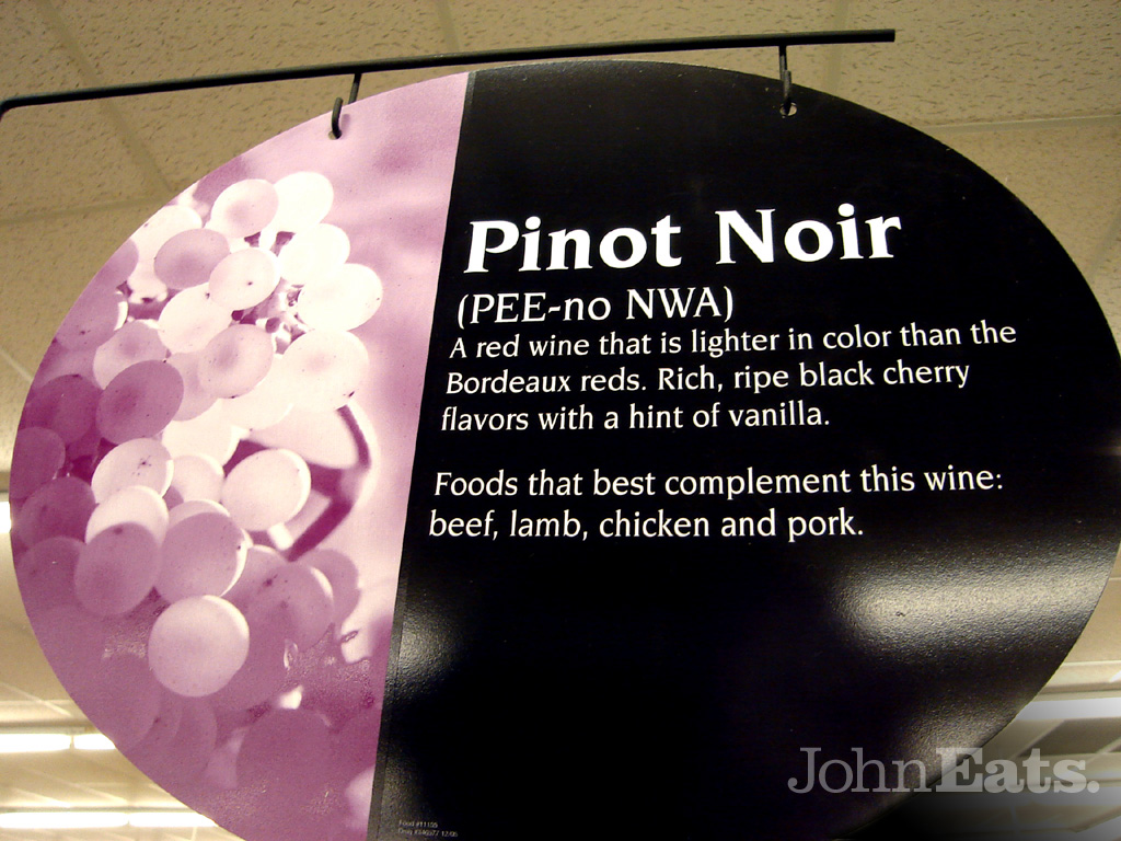
Those of you who don't live in the hearty midwest or/and don't keep up with the financial machinations of the neighborhood pharmacy chain industry may not have noticed the recent CVS rebranding of old Osco pharmacies. While most of the rebranded franchise shops have gained much-needed interior decor makeovers, a few unlucky branches are still waiting for their 21st-century refits. And it is in one of these remodelling-challenged CVS pharmacies that the following photographs were taken. Rather than go all-out with new carpeting, paint, etc., this particular CVS has only invested in a handful of new signs to spruce things up, with varying levels of success.


In an attempt to educate its clientele, CVS has installed attractive, informative signage in the "Wine and Spirits" aisle discussing the ins and outs of the fine wines available for purchase. Here we see the sign for Pinot Noir; note its helpful pronunciation guide, which no doubt has a certain resonance with the consumers of adult diapers over in aisle 9 (not to mention the music fans perusing the cut-out bin of old hip hop CDs in aisle 4).

But it's not just the geriatric set that CVS is courting with its in-store signage projects. Above we have an example of their eye-catching "HOT NEW ITEM!" signs no doubt aimed at the 18-24 market, for whom the word "hot" has connotations of elite status within the singles set. And when I think of hot new items, I think hair lice products. Bravo, CVS! Your marketing department has made pediculosis fun again!

Enjoy using the large versions of these images as desktop pictures. You'll be glad you did.


[ permalink ]

Wednesday, November 28, 2007

ADVENTURES IN THE DESIGN WORLD™: R2-D2 "Soy Source" Bottle vs. Sherwin Williams "Cover The Earth"

So I had a moment of weakness (or was it sheer, soul-crushing boredom?) and I decided to visit TheForce.Net for the first time since Darth Vader let loose with his barbaric yawp. And what do I find? Something actually honest-to-gawrsh entertaining: an R2-D2 soy sauce bottle being sold in Japan, whose marketing collateral's english text declares it a "Soy Source Bottle." Priceless. I particularly like how in the above image, the soy sauce is almost (but not quite) lined up with the hurricane on the planet below, so it almost-sort-of looks like the soy sauce is being poured directly onto the planet and making ripples in the clouds. It reminds me of Sherwin-Williams' "Cover The Earth" -- one of my all-time favorite disturbing logo designs:

Surely nothing strikes eco-terror into the heart of Al Gore like the sight of Mama Earth being coated in blood-red gelatinous house paint. You can just hear the screams of the world's multitudes as their bodies are frozen into Pompeii-like statues of bonded resin and pigment. A timeless classic!

[ permalink ]

Thursday, September 07, 2006

ADVENTURES IN THE DESIGN WORLD™ (VEGA$ EDITION): A Brief Survey Of Casino Carpeting, Part 1

If you're anything like me (and by that I mean you always walk with your shoulders slumped and head pointed at the ground so as to avoid making eye contact with the people around you for fear of having to interact with them in some way that doesn't involve ignoring them and in turn being ignored yourself), the first thing you notice upon entering a Las Vegas casino is, of course, its carpeting.

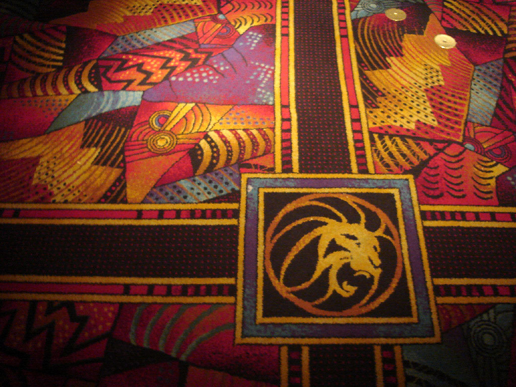
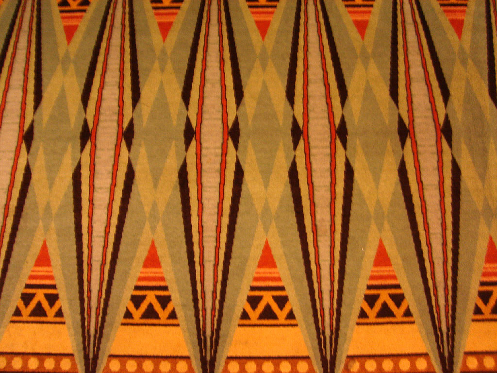
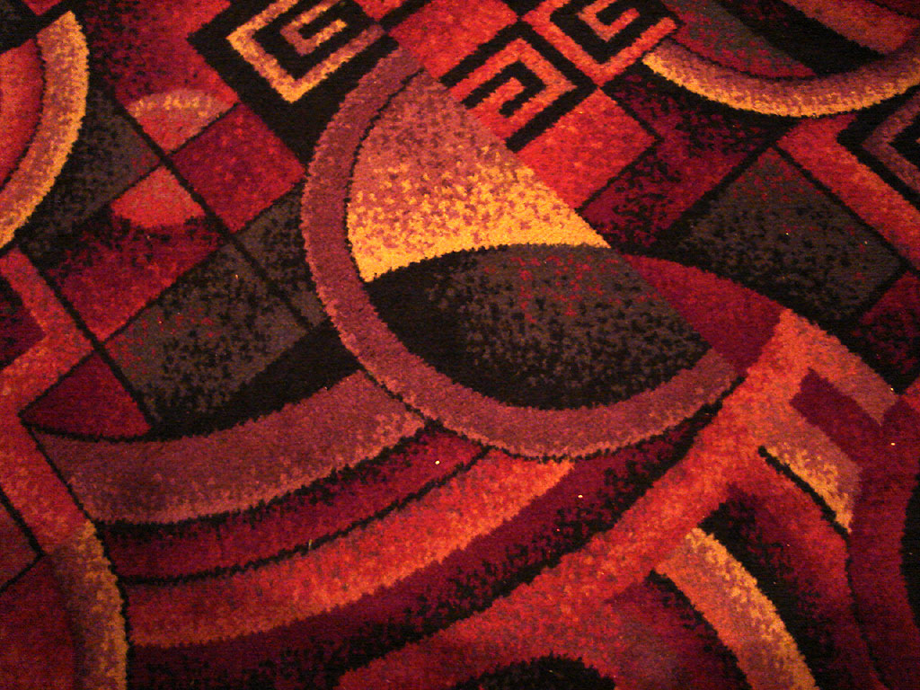
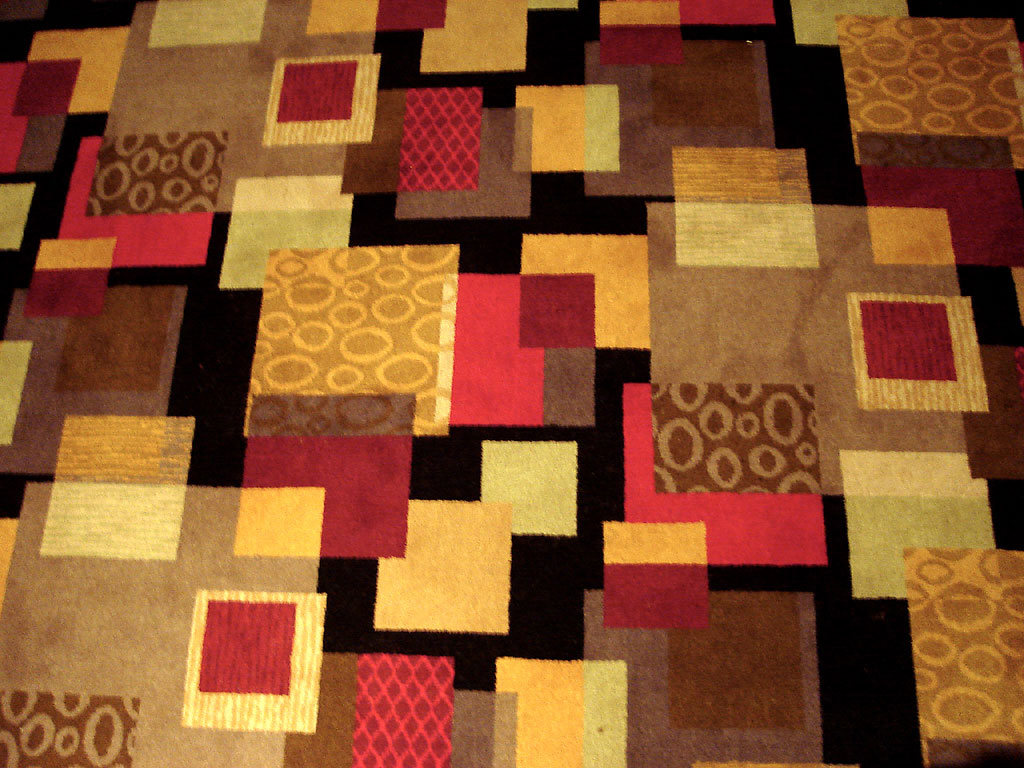
A casino's carpeting choices say a lot about the establishment, with the number of clashing patterns inversely proportional to the amount of quality you'll find in the place's food, gambling options and clientele. This three-part series will present a brief survey of Las Vegas casino carpeting; clicking on the preview swatches will give you access to the full, desktop-worthy patterns. Enjoy.

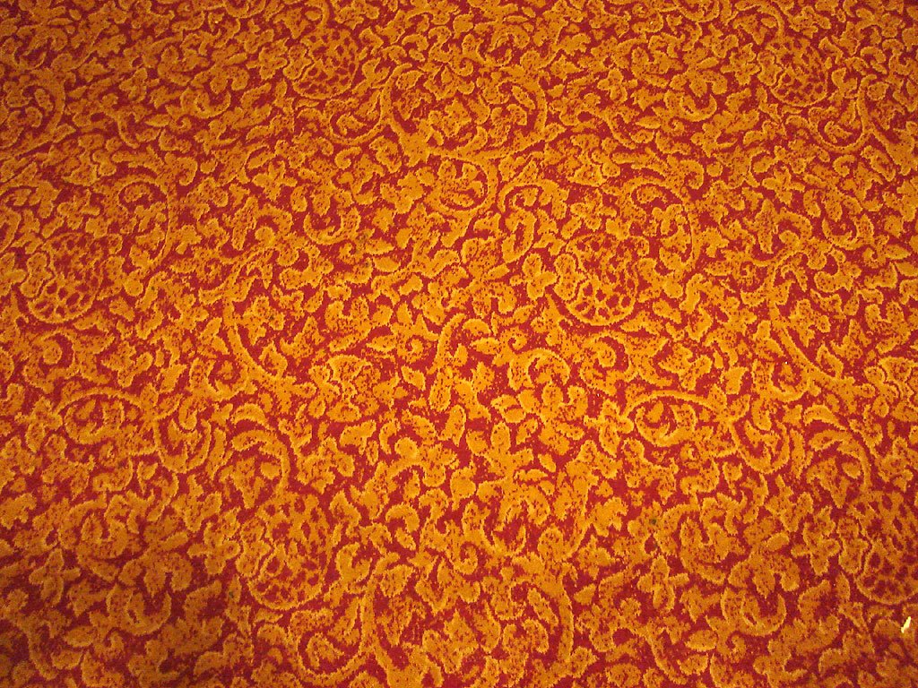
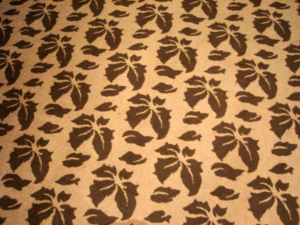
Our first stop is The MGM Grand, our home base. Although we spent the most time at the MGM, I was only able to spot five different carpeting patterns (one of which I had to devise myself, using the tasteful carpeting of our hotel room in combination with the light streaming in from a window). The MGM's carpeting was certainly one of the most tasteful we encountered (with a few notable exceptions):


And here are five patterns from The Aladdin (soon to be replaced by Planet Hollywood). We stopped by there to try the "Spice Market Buffet," but as soon as we noticed that the Planet Hollywood takeover had led to a rebranding of the buffet's collateral using nothing but centered Eurostyle Bold (all caps, no less), we decided the hour-long wait and $25 price tag was a bit much. But that still gave me enough opportunity to photograph no less than five clashing carpeting patterns!


Stay tuned for more carpeting!


[ permalink ]

Friday, September 08, 2006

ADVENTURES IN THE DESIGN WORLD™ (VEGA$ EDITION): Use Your Own Hair


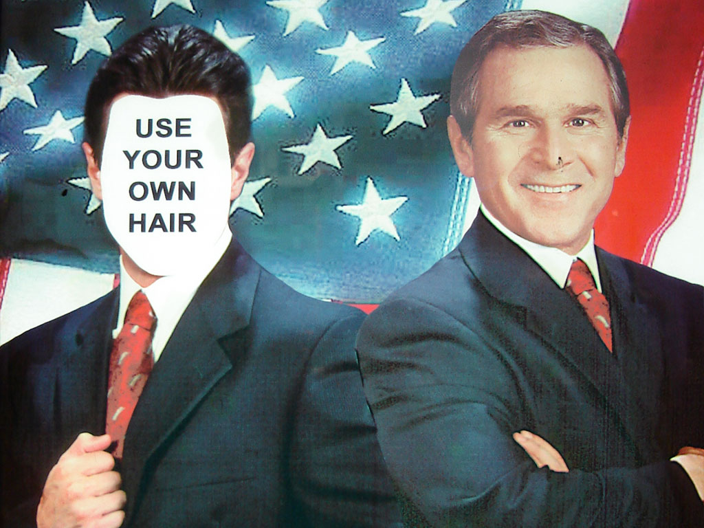
One of the many reasons I adore Las Vegas is because everywhere you (10 LET "YOU" = "TOURISTS" / 20 GOTO 10) go, you encounter things that make you feel like you're living inside the world's largest state fair midway (albeit with a lower percentage of mullets). Take for example this wonderful piece of artwork peeped at a "Get Your Picture Taken With The Stars" booth located in The MGM Grand. This remarkable service allows anyone who doesn't own Photoshop and a digital camera to get their head sort of Photoshopped into a picture with a famous person (or if you're a fat slob of a man, you can become a Chippendale dancer; or if you're an old woman like the one who was using the service when I stopped by, you can get your face stuck onto the head of a naked, saline-enhanced centerfold model) -- and your friends and family can watch the magic happen as the image of your head being clone-stamped to perfection is projected on a giant video screen!

However, not all celebrities are created equal, and it is a select few images which offer more design choices than others. Most images only allow your face to be plopped in the center of someone else's head, leaving your own coiff mysteriously M.I.A. But those rules do not apply if you want to be photographed standing next to George W. Bush -- and come on, we all know you want to. I mean, you're a guy, right? Only guys can have their picture taken with the president! And if you're man enough to stand next to Dubya (in a purely non-threatening heterosexual way, of course), then you're also man enough to USE YOUR OWN HAIR.

[ permalink ]

Monday, June 25, 2007

ADVENTURES IN THE DESIGN WORLD™: The Unfortunate Medical Malpractice Advertisement on the Damen Bus

It's lucky for me that this poster only seems to be displayed on the Damen bus in Chicago, because if it was on the Brown Line or something else I use every day I probably would have torn it down and been fined by now. Lucky for me, I just get to admire its ghastliness occasionally, and consequently have grown rather fond of it. I mean, it's got so much going for it. Like how it uses at least five different fonts and type weights -- and of course, two different serif fonts (you want typographic contrast, you got it!). And its liberal use of underlining, always the mark of excellent design. Then you've got the whole centering thing -- magnifique. Oh, and the novella's worth of copy is pretty marvelous too. But obviously, my favorite part of this poster has to be this:

Yes, the aggressive, compassionate, and experienced Don must be just too busy to get himself photographed with a real live person in a wheelchair, otherwise they wouldn't have had to Photoshop him into a picture with one. I mean, come on, at least try to get the color balance right. And maybe try to keep him in proportion with the guy in the wheelchair (unless this happens to be a midget in a wheelchair). An attempt at a consistent light source might help do the trick too. Or just HAVE THE COJONES TO F*CKING POSE WITH A REAL LIVE PERSON IN A WHEELCHAIR, YOU DOLT.

Sorry, guess I lost it there for a second.


[ permalink ]

Saturday, September 16, 2006

ADVENTURES IN THE DESIGN WORLD™: www.eopd.com


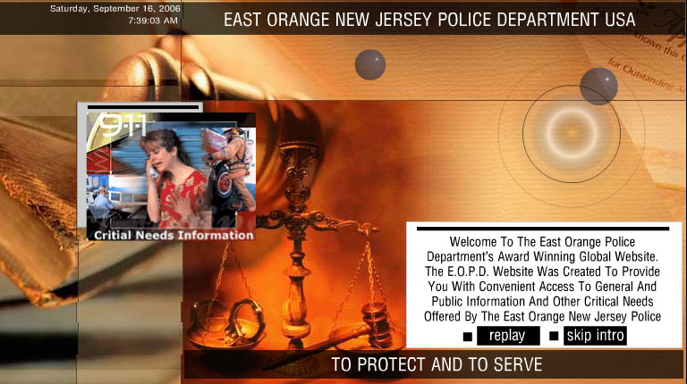
Thanks to a tip from Dartanjal, I'm proud to introduce you to www.eopd.com, the suspiciously unofficial web site for the East Orange New Jersey Police Department and a bona fide interactive design masterpiece. But before you click that link, you might want to read on to prepare your soul for what you are about to witness.

We begin with the obligatory Flash intro (pictured above), a Clockwork Orange-like visual onslaught of internet symbology including ones, zeros, "radar", Gabocorp 1997-esque floating 3-D balls, and a blaringly loud rendition of "The Halls of Montezuma." This eventually lands us on a page with a "critial" typo and (since this is a web site devoted to a police department) an obligatory image of a white woman in serious peril placed underneath the ominous digits "9-1-1."

But wait, there's more!


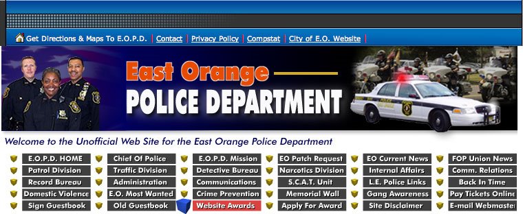
Clicking "skip intro" (which you can't do until you've actually watched the intro) brings you to the site's real content. Immediately we are presented with no less than 36 navigational choices in the site's top-level nav bar! That's 36 choices within the first 312 rows of pixels, an astoundingly high ratio of user confusion-to-screen real estate. The first six links at the very top of the screen immediately present a conundrum since four of them include the traditional text link underline, but the first two don't -- one is simply an icon of a house (okay, this links to the home page, I get it) and the second link to "maps and directions" isn't underlined. Obviously this designer just picked up a copy of Web Site Navigation Made Easier Through Inconsistency (2006 Edition).

But wait, there's even more!

Click on "Chief of Police." Just do it. You've got more 1997-era graphics and an embedded midi file of the Law & Order theme! Homina homina homina! I'm afraid to click anywhere else on this site for fear that I'll still be writing this post three hours from now!


[ permalink ]

Thursday, August 28, 2008

ADVENTURES IN THE DESIGN WORLD™: "You Have A Concrete Floor - I Have Solution"


We've discussed vehicle graphics before, but the above example re-sets the bar at an all-new dizzying height. First off, I would hate to be the poor sucker photographer who's forced to eke out a living by attempting to make concrete floors look appealing to people traveling 35mph and above -- altho judging by the ensuing quality of the images, those look a lot like Small Business CEO Photos™ to me ("Why pay a professional photographer when I can take my own shitty-looking flash photos with my iPhone for free? Wait, what do you mean they're too low-resolution to make any bigger than eight inches wide? Don't think you can sidestep me with all that techobabble mumbo-jumbo, you can do anything with computers these days, you little asshole!"). Then of course comes the racing stripes surrounding a checkerboard pattern, which does a great job of evoking the NASCAR® aesthetic without the pain and suffering of copyright infringement -- but what the fuck does it have to do with concrete floors? Oh, that's right: if you have a concrete floor problem (and I know most of the people who drive these days often do), you want it solved FAST.

Then, as always, we come to the typography. Arial Extra Bold all caps, is it not? Why bother with one of those pansy-ass fonts that don't automatically come with Windows when you can use the real deal - because if anyone knows beautiful typography, it's Microsoft! And yes, a thickly bold san serif is just SO readable in all caps from a distance -- the letter forms don't all just blur together or anything, no sir-ee.

And finally, there's the copy.
YOU HAVE A CONCRETE FLOOR
I HAVE SOLUTION
Let's see...does this mean the owner of the vehicle has in his or her possession a vial of some super-secret chemical substance that can fix whatever problems are inherent within concrete floors? There must be something automatically wrong with concrete floors, as it's implied here that the mere ownership of one must generate the need for a professional's intervention. Or maybe this headline was written by an eastern European who has some trouble picking up on the English language's use of the indefinite article, and no one bothered to proof the copy before it went to press (or in this case, the gerber cutter at the FastSigns® down the street).

Either way, we've got comedy gold here, folks.

[ permalink ]

Wednesday, December 06, 2006

ADVENTURES IN THE DESIGN WORLD™: "Think About The Importance Of A Logo"


Do you have a shitty band? Would your shitty band like a shitty new logo? Then why not let the shitty graphic designers at Coconuts create a shitty new logo for your shitty band?

I don't know what's worse: the GRAPHIC DESIGN non-logo logo, the stream of bullshit promotional copy in that first paragraph under the non-logo logo, or that bizarre figure used in all three images that looks like the bastard lovechild of Larry David and The Martian Manhunter.

Or maybe it's that shitty-looking "angel" in the third image -- the one that's more than vaguely ripped off from the Led Zeppelin angel and is either dry-humping the edge of the picture plane or doing something vaguely Clay Aiken-ish with his right hand.

[Thanks to Anonymous A for the tip]


[ permalink ]

Wednesday, October 04, 2006

ADVENTURES IN THE DESIGN WORLD™: Anything's Possible


Thanks to the eagle eye of Anonymous A, I'm pleased to bring you yet another stunning print ad to ponder.

Take a look at the image above. Not exactly your typical ad, is it? Okay, you've probably seen people hula hooping in an ad before, but there's something about the people being photographed here that strikes you as a little odd. Yes, they're not exactly in the 18-24 demographic; yes, they're not exactly the epitome of the advertising world's standards of traditional beauty/body image. It's not even a very flattering photograph, to be honest - the lighting's horrible and the poses are substantially less than flattering. But I'm sure that headline grabbed your attention, didn't it? You're probably thinking "Well, if these people got to be in an ad, then I guess anything really is possible!"

But watch what happens when you get to see the entire thing:


The story changes entirely, doesn't it? You start to think "Well, if the art director responsible for this ad still has a job, then I guess anything really is possible!"


[ permalink ]

Tuesday, May 06, 2008

ADVENTURES IN THE DESIGN WORLD™: "We Have An Unusual Situation Here."


There's nothing worse in the web design world of 2008 than someone who still insists on designing their site so it can only be used with one browser.

Oh, wait, did I say there was nothing worse? How about someone who insists on designing their site so it can only be used with one browser and then acts smug about how lazy they are?

That's exactly the attitude you get when you visit AmericanLiteracy.com with "one of 59 other browsers" than Internet Explorer. But who can blame them, really? I mean, it's a well-known fact that no one in America who uses a Mac (or Firefox on their PC) gives a shit about literacy.

Oh, and while you're at it -- if you're going to presume to be so learned as to know which browser is best for me -- please learn the keyboard shortcut to actually make a proper elevated trademark symbol (like this ™) instead of the "oh snap, how do you do this?" method of sticking it in lower case inside parentheses. That's what The Google is for, people.

Unreal.

(tipped by Anonymous A)

[ permalink ]

Tuesday, September 12, 2006

ADVENTURES IN THE DESIGN WORLD™: The Nostalgic Branding of VEGA$ Slot Machines

I've already shown you two of my favorite nostalgically branded slot machines (the Star Wars machine and the Kenny Rogers machine) but I'm sure you've said to yourself "John Eats must have seen some other machines branded in such a way as to exploit the borrowed interest of a beloved television or movie franchise in order to attract those who wouldn't normally stuff money into a slot machine!"

Well, you're absolutely right. Here's an extremely brief gallery (clickity click on them for extra-large gambling photo goodness) of machines built solely to attract my demographic: the 24-40 age group whose cynicism towards gambling could be easily crushed when they see how fricking cool it is to gamble with the ALIEN:


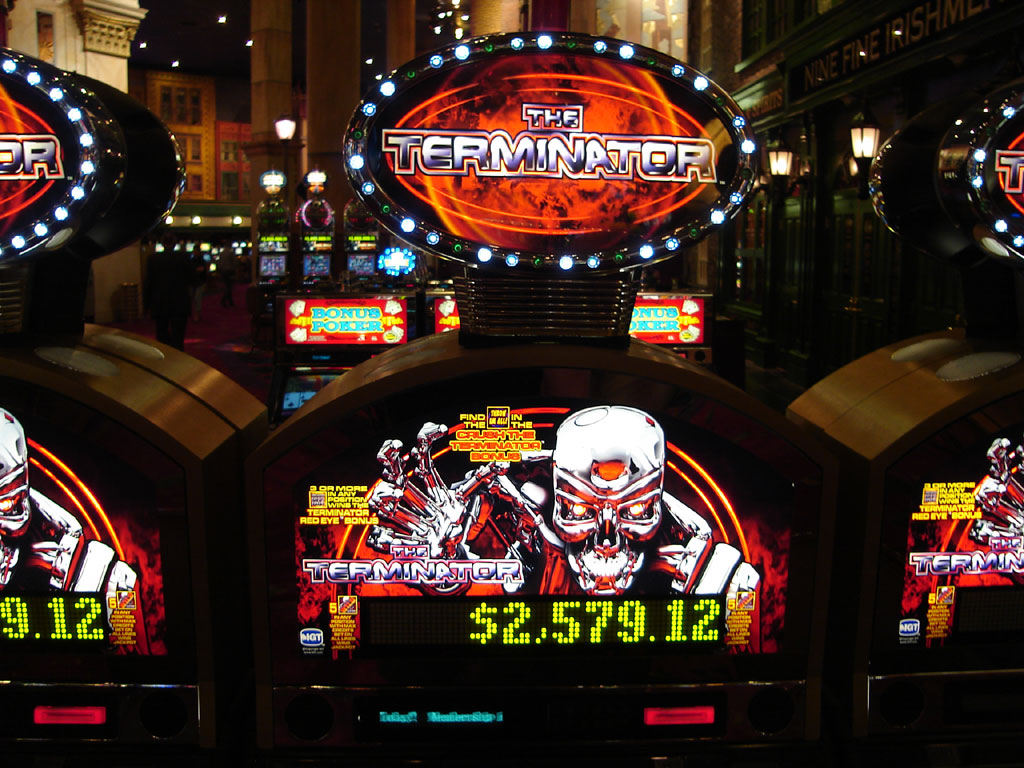
Or maybe you'd rather travel through time to kill Sarah Connor for the good of humanity (and by "travel through time to kill Sarah Connor for the good of humanity" what I really mean is "stuff $20 bills into a loud, visually attractive machine and repetitively press one of three buttons until your money disappears")?


And now we come to the world of television...remember how great Dick Clark used to make you feel at the beginning of each new year (before he had his stroke, I mean)? Well, now you can relive a little bit of that magic any day of the year by emptying your pockets into this baby, which I think deserves two pictures (one to display the falling shiny ball, the other to accentuate the detailing of Dick's face):


And then there's the game show connection. Who doesn't love them some Wheel of Fortune now and again? Well, this bank of slot machines has its very own oversized spinning wheel, even more lifelike than Pat Sajak's hair!


And finally, nothing gets the heart thumping and the $20 bills inserting like Jan Hammer's classic theme song accompanied by cartoon representations of Don Johnson, Philip Michael Thomas, Edward James Olmos, and flamingoes:


[ permalink ]

Tuesday, July 25, 2006

ADVENTURES IN THE DESIGN WORLD™: "Website Design"


Photographed in situ at Capstone Consulting -- not in 1996, but in 2006 -- this 8.5" x 11" wonder should have the clients lining up in droves. Everything about it screams professional, from its circa 1982 "Dawn of the Home Computer"-era headline design to its prodigious use of Times Roman Bold Italic (flush justified in an uncomfortably broad column width, of course), right down to the widowing of "without," a word so utterly devoid of positive connotations that no self-respecting advertising designer should ever shy away from giving it visual emphasis. And let's not forget the "Everything In Its Place -- That's Right, THE CENTER" composition. Oh, and the copy writing's a real corker as well.

A graphic blunder of astronomical proportion, or a miracle of post-modern irony?

You be the judge.

[ permalink ]

Tuesday, May 22, 2007

ADVENTURES IN THE DESIGN WORLD™: Bald Guyz™ Refreshing Head Wipes

On the way out of the local CVS pharmacy this weekend, Anonymous A's eagle eye spotted the above head-care product amongst the shampoos and conditioners. Of course, I had to get a photo, and upon further research I discovered that the Bald Guyz™ marketing team have taken a decidedly "Girls Gone Wild" approach to promoting their products -- in the above example, baby wipes repackaged as specially-formulated skin care for the discerning bald head.

However, it isn't the attempts at assigning bald men amped-up testosterone that really interests me here (although, let's face it, what bald man doesn't ooze pheromones like they were going out of style?), it's the personalized touch of including the names and occupations of the bald men who have been drafted in to pose for the pictures that pimp the products. I mean sure, we all know that firemen are super-sexxxy, and ergo experts at how to properly maintain one's bald pate so as to attract the honies. But will the fact that I know Shawn Wilson is a "researcher" actually influence whether or not I as a bald man choose to purchase this product? What does he "research"? Does he research proper bald head skin care, or is he just leading a study on how to properly get one's swerve on? Can I see some credentials, please?


[ permalink ]

Tuesday, April 24, 2007

ADVENTURES IN THE DESIGN WORLD™: The Idealized Spa Owner Portrait


Recently while wandering through the bowels of weekday-afternoon interior pedestrian walkway Chicago, I came upon this painting in the hallway outside of a local hair salon/spa. At first I was struck by the pedantic brushwork, lack of well-defined form, perspectival inconsistencies, high school notebook-quality hand lettering, and vomit-inducing color palette. But upon closer inspection, I began to notice details that made this painting truly horrifying: the turgid presentation of a local spa owner; the subtle implied halo around the top of his head; the attempts to place this man in historical Rome as a man not merely rendering unto Caesar, but apparently burying him and replacing him as well. I started to wonder what the history was behind this painting, whether it had been painted by one of the spa owner's former tawdry affairs, and whether one of his heroes in life was the guy in those old D.O.C. Optical "Sexy Specs" ad campaigns.

Then I realized I'd wasted a good thirty seconds of my life staring at this piece of crap.


[ permalink ]

Tuesday, October 17, 2006

ADVENTURES IN THE DESIGN WORLD™: Advertising Should Be This Delicious


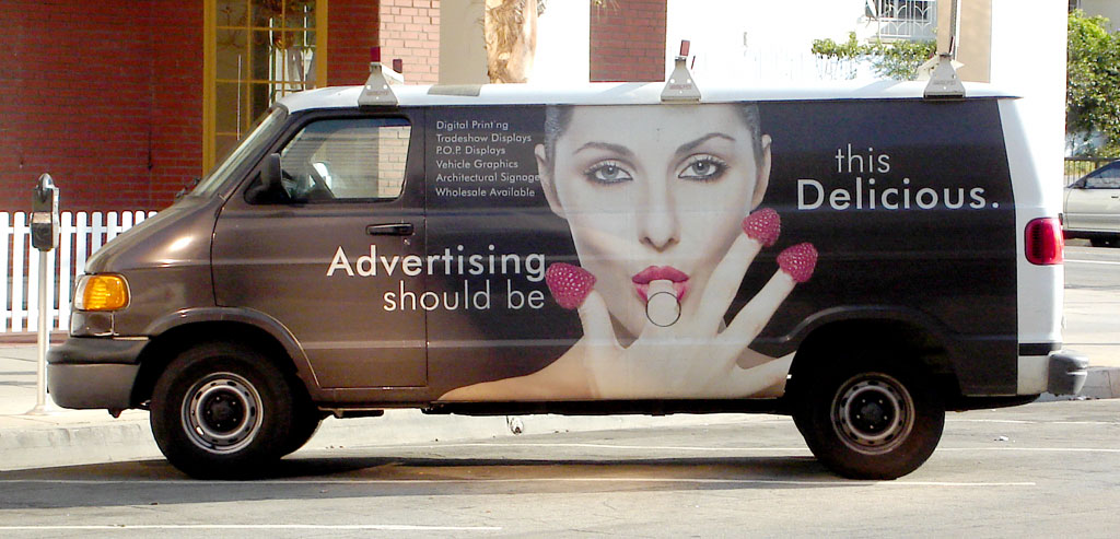
So, could anyone out there please tell me what it takes to finally flick the little switch in someone's brain to allow them to think that this kind of thing is okay?

I mean, when does a person get to the point where not only do they think "Dude, it would be SO FUCKIN AWESOME to stick a big picture of a hot chick sucking raspberries off her knuckles on the side of my van!", but also that they firmly believe doing this will actually drive customers to their business?

As if you needed anything more to make a little bit of puke well up in the back of your mouth, click on the photo to get the full sized detailing of the strategic placement of the gas tank cover.

That's right, every time you fill 'er up, you get to shove your hose in her mouth.

"SO FUCKIN AWESOME!"

People of planet Earth, your world makes no sense to me.


[ permalink ]

Monday, May 12, 2008

ADVENTURES IN THE DESIGN WORLD™: 50 Of The Worst Album Covers In The World


Bad album covers never cease to entertain, and Anonymous A just pointed me towards yet another online collection of the best of the worst. There are some real gems in here, and I've only seen a couple of them before, like the Joyce album which I think has been included in every online collection of bad album covers I've ever seen -- and yet that doesn't seem to detract from its overall awfulness. Enjoy.

[ permalink ]